


Are you finding the future approach of mobile friendly website design? In website design, the mobile first approach is grown as a game-changing strategy. But is this mobile first approach really the future of website designing?
Let’s go into this topic deeper and explore why it’s become such a hot trend in the digital industry?
The Future of Website Design
As my view point the mobile first approach is a shift in how we think about developing digital experiences which makes it more than an idiom in website design. Designing for mobile devices first and scaling up for larger screens, such as tablets and desktops, is the essence of mobile-first design.
This approach turns the traditional desktop-first method on its top. Instead of starting with a full-sized website and then stripping it down for mobile, we begin with the mobile experience and progressively enhance it for larger screens. It’s like starting with a tiny picture and gradually expanding your user friendly web design.
Why Mobile-First Has Gained Traction
The rise in mobile usage is undoubted. We are practically stuck to our smartphones, using them for everything from quick Google searches to in-depth research and online shopping. This type of shift in user behavior has operated the mobile first approach to the forefront of web design strategies.
Google’s mobile-first indexing has been a significant enabler in this changeover. With the search huge prioritizing mobile-friendly sites in its rankings, adopting a mobile first approach has become essential factor for SEO success. It’s clear that mobile isn’t just a supporting player anymore – it’s like taking center stage in the digital world.
The Benefits of Mobile-First Design
- Enhanced User Experience: By prioritizing mobile design, you’re catering to the majority of your users right from the start because mobile first approach ensures that your site is optimized for smaller screens, providing a seamless experience for the growing number of mobile users.
- Faster Load Times: Mobile-first designs tend to be leaner and more efficient. By focusing on the most important elements from the start, you’ll likely create a site that loads quickly on all devices. This is essential today, as users expect websites to load fast and often leave if a site is slow.
- Improved SEO Performance: With Google’s mobile-first indexing, adopting a mobile first approach can significantly boost your search engine rankings. By prioritizing mobile-friendliness, you are aligning your site with Google’s preferences, potentially leading to better visibility in search results.
- Future-Proof Design: As mobile usage continues to grow, a mobile first approach ensures that your site is ready for the future. You’re not just designing for today’s users, but for tomorrow’s mobile-centric target audience as well.
- Focused Content Strategy: The mobile first approach forces the designers and content creators to focus on what’s truly essential. With limited screen real estate, every element must earn its place. This often results in a more streamlined, user-focused experience across all devices.
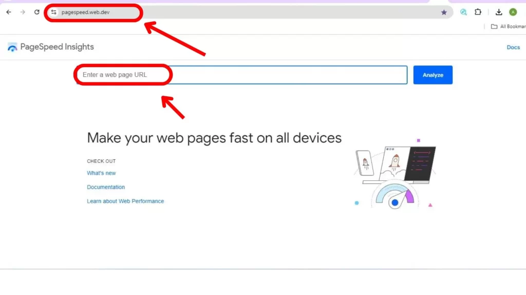
To check mobile friendliness of your website use google tools page speed insight

The Mobile-First Design Process
Adopting a mobile first approach requires a shift in mindset and workflow. Here’s a more detailed look at the process:
- Start with Mobile frame: Begin by sketching out your design for the smallest screen size. This forces you to prioritize content and features from the very beginning.
- Focus on Core Content and Functionality: Identify the most crucial elements of your site. What do users absolutely need to accomplish their goals? This becomes your mobile foundation.
- Progressive Enhancement: As you scale up to larger screens, gradually try to add more complex features and content. This ensures that your site remains functional and attractive across all devices.
- Optimize for Touch: Remember that mobile users interact with touch, not mouse clicks. Design with larger touch targets and with easy-to-use gestures in mind.
- Prioritize Performance: Mobile users often have slower connections. So, optimize images, minimize code, and leverage caching to ensure speedy load times.
- Test Across Devices: Use real devices and competitor to test your design at various screen sizes and resolutions. This facilitates the rapid identification and resolution of any problems.
For making the mobile first design of your website, contact alldigitalmarketingservices.com
Challenges of Mobile-First Design
While the mobile first approach offers numerous benefits, it’s not without its challenges are:
- Limited Screen: Designing for small screens can be tricky, especially for content-heavy sites or complex applications.
- Feature Prioritization: Deciding which features to include in the mobile version can be a tough balancing act.
- Scaling Up Effectively: Ensuring that the design scales up smartly to larger screens requires careful planning and execution.
- Performance Considerations: While mobile-first often leads to better performance, it requires constant vigilance to maintain speed as features are added.
Despite these obstacles, the mobile-first strategy frequently produces more creative, user-centered solutions. It’s like trying to pack for a trip with just a carry-on – you quickly learn to prioritize what’s truly essential.
Real-World Success Stories
Many companies have seen significant benefits from adopting a mobile first approach:
- Etsy: The e-commerce platform saw a 30.9% increase in mobile conversion rates after implementing a mobile-first redesign.
- Spotify: Their mobile-first redesign led to a more spontaneous user experience across all devices, enhancing user engagement and satisfaction.
- Pinterest: By focusing on a mobile first approach, Pinterest saw a 50% increase in mobile sign-ups and a more coherent cross-device experience.
Is Mobile-First Really the Future?
As we look to the future of website designing the mobile first approach stands out as a crucial strategy. Because It’s not just a trend, but a response to the fundamental shift in how people access and interact with the web.
However, it’s important to note that mobile-first doesn’t mean mobile-only. instead of the goal is to create flexible, responsive designs that work beautifully across all devices. Mobile-first is the starting point, not the finish line.
As long as mobile usage continues to dominate (and all indicators suggest it will), the mobile first approach will remain a cornerstone of effective web design. It’s about meeting users where they are, providing seamless experiences regardless of device, and staying ahead in an increasingly mobile-centric digital landscape.
Embracing the Mobile-First Revolution
Adopting a mobile first approach isn’t just about keeping up with trends – it’s about future-proofing your digital presence. It’s a commitment to creating websites that are fast, functional, and fabulous on the devices most people are using.
By putting mobile users first, you’re not just designing a website – you’re crafting an experience that adapts seamlessly to whatever screen it’s on. If you’re prioritizing your users’ needs, focusing on what truly matters, and building a digital presence that’s ready for whatever the future holds.
So, are you ready to embrace the mobile-first revolution? Comment down below your thoughts
FAQs About Mobile-First Design
How do I know if my site follows a mobile first approach?
Check if your site is responsive, loads quickly on mobile devices, and prioritizes mobile-friendly features. Use Google’s Mobile-Friendly Test for a quick assessment.
What exactly does “mobile-first” mean in web design?
It means designing for mobile devices as the primary platform, then scaling up for larger screens, rather than starting with a desktop design and scaling down.
How can I test my website’s mobile-friendliness?
Use tools like Google’s Mobile-Friendly Test, BrowserStack, or simply test on various mobile devices and browsers. Pay attention to load times, navigation ease, and overall user experience.
Is a mobile first approach suitable for all types of websites?
While it’s beneficial for most sites, some content-heavy or complex applications might need a more balanced approach. Always consider your specific audience and their browsing habits.
What’s the main difference between mobile-first and responsive design?
Mobile-first is an approach where you design for mobile first, then scale up. Responsive design ensures a site works well on all screen sizes but doesn’t necessarily prioritize mobile in the initial design process.
How does mobile-first design impact SEO?
Mobile-first design aligns with Google’s mobile-first indexing, potentially improving search rankings. It also often leads to faster-loading sites, which is another positive SEO factor.
By adoption a mobile first approach in website designing, you’re not just keeping up with current trends but also you’re preparing for a future where mobile devices are the primary gateway to the digital world because you are investing in the long-term success of your digital presence, SEO performance, and user experience.